Cooperatives Europe · Since 2021

Rebranding & brand development

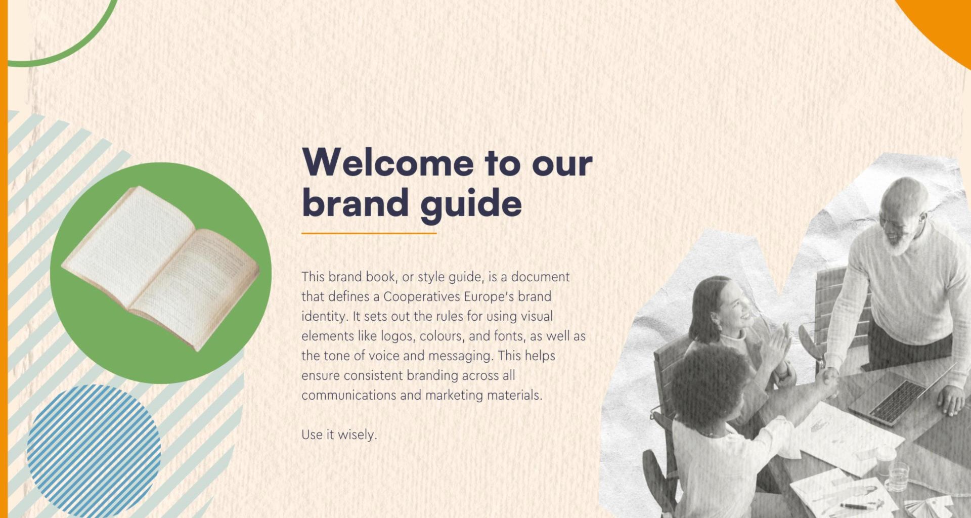
A rebrand I started on my own initiative: noticing the inconsistencies and the lack of a clear identity, I pushed for a new brand and led it over several years, moving Cooperatives Europe from a rigid, corporate look to a warmer identity, documented in a living Brand Book.

Own initiativeBrand strategyStakeholder inputVisual identityBrand BookRoll-out across channels
Branding
Rebranding & brand development

The challenge

When I joined in 2021, Cooperatives Europe's visual and digital identity felt rigid and corporate. It lacked the human warmth you expect from an organisation run by and for its members, there were no shared brand guidelines, and every channel looked slightly different. Nobody had asked for a rebrand: I noticed the inconsistencies myself and pushed for one.

What I did

I built a communication strategy from input by the board, the members and our own data, and turned it into a new identity step by step over several years, starting with the website in 2022. The new look uses organic paper textures, warmer colours, circular motifs and cut-out photography, with a clear brand personality behind it. I documented everything in a Brand Book so that every colleague can apply it.

A living document

The Brand Book is not a one-off file. It is a living document that we keep updating as new formats come up, so the team can fine-tune and extend the brand without hiring a design agency for every new need.

The result

A consistent identity across the website, social media, events, publications and print, which saw immediate increases in time spent on the website and positive feedback from members and the board.
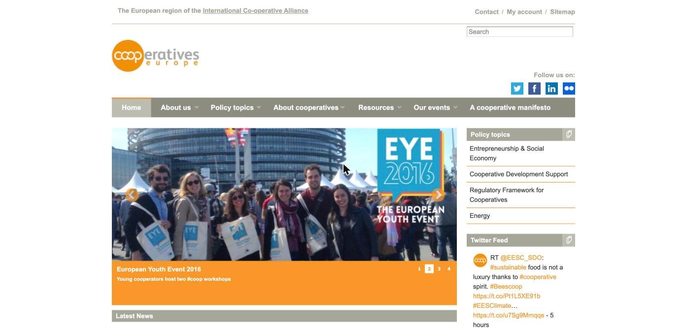
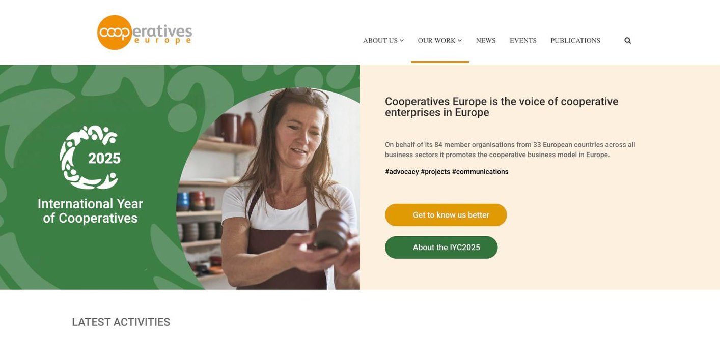
Before and after

Website before the rebrand
Website after the rebrand
Illustration until the real screenshots are addedBeforeAfter

How the rebrand came together

A rebrand usually follows the same broad steps. This is how they played out at Cooperatives Europe.

  1. 1Audit

    Took stock of how the organisation looked and sounded across the website, social media, events and print, and where it was inconsistent.

  2. 2Listen

    Gathered input from the board, members and staff, and looked at what our data said about what audiences responded to.

  3. 3Define

    Set the brand personality: a Connector that brings people and ideas together, and a Sage that shares trusted knowledge.

  4. 4Design

    Developed the visual language: a new colour palette, paper textures, circular shapes, cut-out photography and a consistent tone of voice.

  5. 5Document

    Wrote the Brand Book with clear rules and examples, so colleagues can apply the brand without specialist help.

  6. 6Roll out

    Applied the brand step by step, starting with the website in 2022, then social media, events, publications and print.

What the Brand Book sets

Brand personality

Two archetypes, Connector and Sage, that shape how we write and what we prioritise.

Tone of voice

Inclusive and engaging when we connect people, thoughtful and informative when we share knowledge.

Colour palette

Four named primary colours with fixed codes: Asparagus green, Carrot orange, Air superiority blue and Mulberry purple.

Visual language

Warm paper textures, circular motifs and cut-out photography that put people at the centre.

Logo and typography

Rules for using the logo and fonts, so everything looks the same everywhere.

Consistency across channels

One look for the website, social media, event materials, publications and print.

The Brand Book and the new look in use